Public Service Application UX
Design exploration of a high-stakes public service enrollment flow, focused on clarity, accessibility, and applicant confidence.
- Public-facing
- Compliance-driven
- Mobile-first
The problem
Applicants navigating eligibility-based public service enrollment workflows often struggle to understand progress, required documentation, and submission status—particularly when requirements are conditional and compliance language is presented without clear guidance.
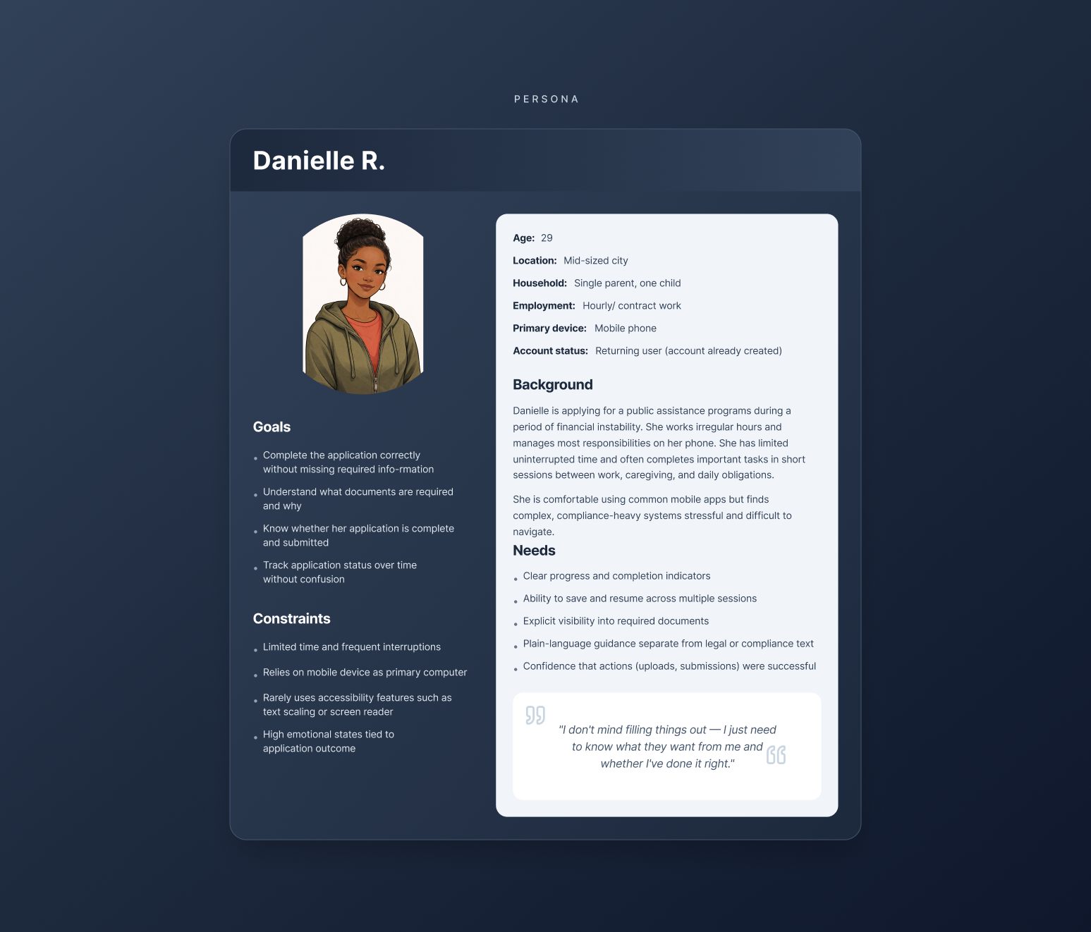
Understanding the applicant
This work focused on applicants completing long, interruption-prone public service applications primarily on mobile devices.
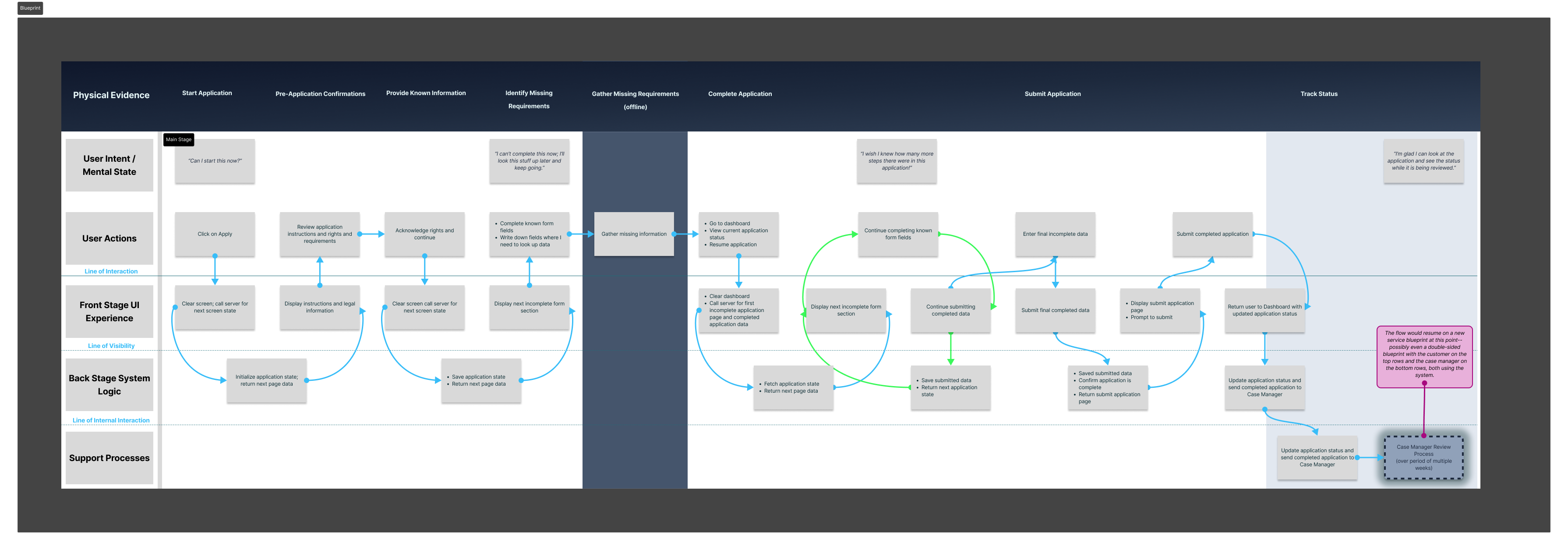
Service blueprint
To identify where applicants lose confidence or abandon the process, the end-to-end enrollment flow was mapped across user intent, front-stage UI, and back-stage system behavior.
Exploring progress models
We explored multiple progress and requirement models to help applicants understand what was required, what had been completed, and what remained—without relying on late-stage error messages.
Final direction
A guided checklist-based enrollment model that made requirements explicit, surfaced document needs early, and separated plain-language guidance from compliance detail.
Resulting design
The final experience clearly communicates progress, outstanding requirements, and application status across mobile and desktop contexts, supporting both assistive navigation and applicant confidence.
Note: This case study represents an independent UX design exploration informed by real-world public service workflows. It is not affiliated with or endorsed by any government agency.